
Written by Sean Yang | edited by Siyu Yan
We, as humans, are faced with the incredibly difficult choice of choosing what to eat for our meals everyday. Colourful pictures, photographs and illustrations fill storefronts and menus, each with their own unique amalgamation of food to create an appetising meal. Eventually, we settle on something familiar (because, as a species, we are afraid of change) or something that “looks nice”.
However, what is really happening subconsciously? Do the colours in the pictures play a role in our appetite?
Let’s start simple – say, with pasta, a commonly enjoyed dish. We are all familiar with its distinctive rich red colour from ripe tomatoes.
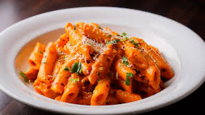
But if we remake this pasta, say with turquoise colouring, it seems to lose its sudden appeal, as though it’s made of Play-Doh. Perhaps it’s appetising to a three year old, but not quite to a grown person.
Why does this phenomenon occur? It all comes down to how our brains function as a species. Our brain is a major processing hub, responding to the external stimuli we receive. Every second, we draw connections between our senses and emotions to form memories. From birth, we begin remembering what tastes good, along with a mental snapshot of the food and its associated colours.
Revisiting the pasta example from earlier, we notice that these colours are opposite in hue. Multiple studies have shown that we associate warmer colours – such as those earthy reds and oranges – with savoury foods, and cooler greens and blues to sweet foods. Our brain subconsciously assumes initially that the food is meant to be sweet or a dessert, but when it fills in the gaps with the information that it is pasta, there is a dissonance that arises and our appetite vanishes as quickly as it appeared.
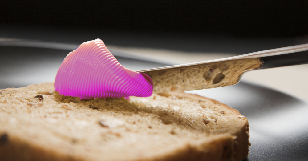
Unsurprisingly, when we’re presented with uncommon hues, we recoil with disgust. In a study with around 700 participants, they were given a series of questions along with pictures and asked whether this increased, decreased, or had no impact on cravings. Regardless of age and gender, the consistently unappetising hues were blue, pink, grey and black, while the most appetising hues were white, orange, red and green. We rarely eat blue and pink foods, while grey and black often means something has gone severely wrong during the culinary process.
Now that we’ve understood how colour affects our propensity to eat, we can appreciate the rather amusing story of how we almost ended up with pink margarine.
Our story begins in 1800s France (like all good stories do), heading towards a war (again like all good stories do) with Prussia. Butter was deemed too expensive by Napoleon and he urged scientists to find a cheap way to feed the entire population. Our fellow French chemist, Hippolyte Mège-Mouriès, synthesised a spread from beef fat. He named it oleomargarine, from which the word margarine is derived. While it was indeed cheap and long lasting, the uptake was sluggish at best.
By the time margarine was introduced to the United States in the 1870s, times were changing. If you didn’t have money, your only option was expired butter – so something cheap like margarine took off immediately. Dairy farmers were, unsurprisingly, dissatisfied with this. By 1882, New York alone was pumping out 20 million pounds of margarine per year.
Thus, the margarine and butter wars began. Avid dairy enthusiasts claimed that it threatened the “American way of life” and societal structure. Factories were accused of mixing in any carcinogenic material they could find: poisons, detergents, even rubber boots. Misinformation spread like wildfire and politicians jumped on, passing laws to stop the uptake of margarine. New York even attempted to completely ban margarine in 1884.
Now, we must understand that while butter is churned out and becomes a warm golden colour, margarine is heavily processed and appears white, almost like plaster. Margarine manufacturers, in an attempt to make it more appealing, would colour it yellow before packaging it for sale. This infuriated butter farmers, who feared that their industry would become a dying flame.
Farmers lobbied for colour constraints on margarine, and laws were passed across the country mandating that margarine be dyed a colour other than yellow. Pink by far became the most popular, as we discovered earlier, it was extremely unappetising.
Yet after all that, margarine still retained its popularity, finding its way onto dinner tables during the Depression and rationing periods of World War I and II. With further developments in margarine production, using hydrogenated vegetable oils rather than animal fats, margarine surpassed butter in sales.
Manufacturers discovered an ingenious way to use dye packs to colour margarine yellow, effectively bypassing the law. Rather than manufacturers colouring it, consumers who had already purchased the product were entitled to do anything with it.

Advertisements and margarine sales both increased, touting its benefits at a fraction of the price. By 1967, restrictions on margarine colour were finally lifted. Health enthusiasts were attracted to the fact that margarine had lower saturated fats compared to butter which was linked to cardiovascular disease. Supermarkets were soon filled with margarine.
But like all heroes, margarine had a tragic downfall. A new kind of fat, called trans fat, was discovered in margarine, and with the turn of the millennium, people started caring more about health, so margarine gradually started to be replaced by butter again. Manufacturers scrambled to remove hydrogenated oils, but consumer mindsets had already shifted. It was too late.
Butter consumption is now up 21% since its lowest point in 1997, while margarine is down 70% since its peak in the 1970s. Perhaps it was how quickly it surged in popularity, or the countless hardships that margarine endured – but one thing we know for sure: us humans don’t like change.
Average Rating